
Branding 101
Logo redesigns decoded: When to refresh and when to hold on
You know, the ones—faded in all the right places, perfectly comfortable, and with just enough stretch to handle that extra slice of pizza. But there comes a time when even your most beloved jeans start to fray, and you have to ask yourself: patch them up or find a new pair?
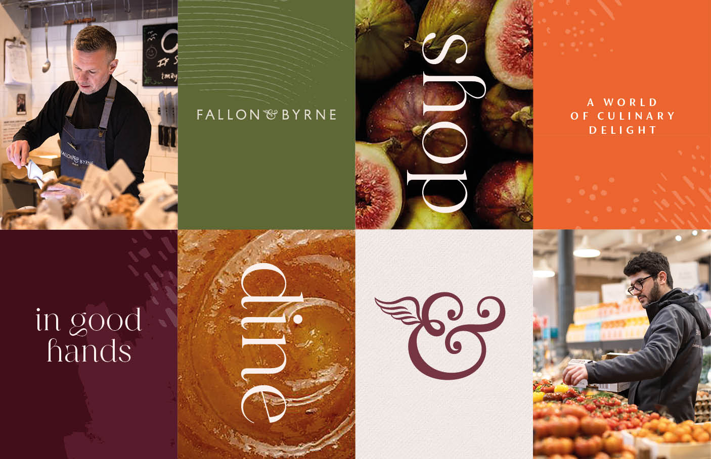
That's your logo. Over time, it may look outdated, no longer fit your brand, or struggle to keep up with market trends. When we worked with Fallon & Byrne to refresh their brand and logo design, the goal wasn’t to reinvent the wheel but to refine and modernise their identity while preserving the warmth and heritage their audience loves.
So, when do you refresh it and take the plunge into a complete redesign? Let's chat about how to strike the perfect balance without losing your brand's personality—or your audience's trust.
1. When to refresh your logo (and why it's like a makeover)
Sometimes, your logo doesn't need a complete overhaul—it just needs a little sprucing up. A refresh can make all the difference in keeping your brand relevant without scaring off your loyal customers.
When to consider a refresh
You're Expanding: If you're entering a new market, a subtle update can help your logo resonate across different cultures and demographics.
Rebranding Light: Are you changing your mission or tone of voice? A refreshed logo can signal the change without sacrificing your brand's identity.
The Glow-Up Effect: Maybe your logo is stuck in the 1990s. A modern typeface or updated colour palette can work wonders.
We once updated a logo for a client who thought Comic Sans was still cool. Spoiler: It wasn't. The refresh brought them into the 21st century, and their audience loved it.
2. When to retain your logo (because classics never go out of style)
If your logo is iconic, a drastic redesign could send the wrong message. Remember when Gap tried to change their logo? The backlash was so swift they reverted within a week. Lesson learned: don't mess with a good thing.
Keep your logo if:
It's instantly recognisable: Think McDonald's golden arches or Nike's swoosh. Why fix what's not broken?
It's emotionally resonant: If customers associate your logo with reliability or nostalgia, changing it could break that bond.
It's flexible: If your logo works across print, digital, and physical spaces, consider yourself lucky—it's a keeper.
3. How to pull off a successful logo redesign
Retain Key Elements
Evolution, not revolution, is often the best approach. Keep the aspects that resonate with your audience—be it colours, typography, or a specific icon.
Example: Coca-Cola's logo has remained largely unchanged for over a century, proving that consistency is key.
Embrace Timelessness Over Trends
Trends come and go (looking at you, gradient overload of 2010). Focus on creating a logo that will stand the test of time while feeling modern.
Let Your Audience Have a Say
Your customers are part of your brand's story. Share sneak peeks or conduct surveys to gauge their feedback—it shows you care about their opinion.
During one redesign project, we shared three options on social media. The audience favourite? The one we almost scrapped! It turns out they know what they want.
4. Case studies: logos that got it right
Google: small tweaks, big impact
Google's subtle logo updates over the years show how a brand can evolve without alienating its audience. Each change is modern yet familiar, making it a masterclass in refreshes.

Image source: Google
Pepsi: Reinventing the Wheel (Literally)
Pepsi has rebranded multiple times, each iteration reflecting the zeitgeist. Their 2008 redesign embraced a new logo shape and colour balance, aligning with their youthful vibe.

Image source: Pepsi
Burger King: Retro Done Right
Burger King's recent redesign is a nostalgic nod to its 1970s logo. By going retro, they managed to feel fresh and modern, appealing to new audiences while delighting long-time fans.

Image source: Burger King
5. The Risks of Logo Redesigns (And How to Avoid Them)
Losing Brand Recognition
Stray too far from your current design, and you risk confusing or alienating your audience. Avoid this by retaining familiar elements and communicating changes effectively.
Overspending on Unnecessary Changes
A complete redesign isn't always necessary. Evaluate your logo's strengths and weaknesses before diving into a full-scale overhaul.
Pro Tip: Keep it simple. Complexity doesn't equate to effectiveness—your logo should look good on everything from billboards to business cards.
6. How to Measure Success Post-Redesign
Engagement Metrics
Monitor website traffic, social media engagement, and customer feedback to see how the redesign is being received.
Audience Sentiment
Gather qualitative data through surveys or focus groups. Their insights can help you refine future branding efforts.
Key Takeaways: Refresh, Redesign, Retain
1. A refresh can breathe new life into your logo without losing its essence.
2. Retaining familiar elements strengthens trust and recognition.
3. A thoughtful redesign balances innovation with tradition, ensuring your brand remains relevant and recognisable.
Let's Redesign Your Logo with Impact
Is it time to give your logo a facelift or a complete overhaul? At BrandNew Creative, we specialise in logo redesign services that balance creativity with strategy. Let's create a logo that stands out, stays relevant, and resonates with your audience. Contact us today!


